{16/04/14}

Today I visited the Design Museum which is now holding three exhibitions called; 'Designs of the Year 2014', 'In the Making' and ' Hello, My name is Paul Smith'. I haven't been to the Design Museum since 'In the Future' exhibition in September 2013 and so I was looking forward to what it may present and I hope there would be some artist references that I can use for my project.
DESIGNS OF THE YEAR 2014
"Now in its seventh year, Designs of the Year gathers together a year
of cutting-edge innovation and original talent; showcasing the very best
in global Architecture, Digital, Fashion, Furniture, Graphic, Product
and Transport design.
Featuring Kate Moss’s favourite app, a floating school in a Nigerian
lagoon, friendly lamp posts, a mobile phone you can build yourself and
many others, Designs of the Year 2014 include international design stars
such as Zaha Hadid, David Chipperfield and Miuccia Prada, alongside
crowd-funded start ups and student projects. This not to be missed
exhibition is a clear reflection of everything that is current and
exciting in the world.
In total, there have been 76 nominations for Designs
of the Year. After the success of its first outing in 2013, the Visitor
Vote will return, allowing visitors to the Design Museum to pick their
favourite design from the exhibition."
As I went up the stairs to go to the exhibiton, it had a different opening compare to most basic wide gap space. It showed two thin white walls that were in a zig zag formation with the the title 'DESIGN MUSEUM: DESIGNS OF THE YEAR 2014' and on the other was a list of what designs it is displaying, it is arranged into themes using keys colours of fluorescent yellow, orange and a range of colours. I feel like this entrance is unique by engaging the public to weave inside the exhibition as well to to vote which design is best, although people don't really take notice about this but I feel it allows them to engage quickly.


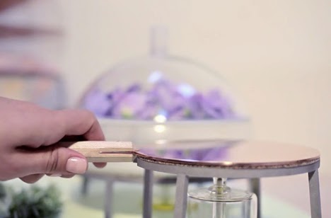
'The Alchemist's Dressing Table' by Lauren Davies.
{The Alchemist's Dressing Table by Lauren Davies from Dezeen on Vimeo.}
As I explored the exhibition I discovered 'The Alchemist's Dressing Table' by Lauren Davies. It is something perfect to look at for my natural skin care project and I wanted to know a lot more about it. It shares the same priniciple of creating our own beauty creams and cosmetics using natural elements, it shows the same concept I wanted to do for my project by being in control of what is on their skins.
In the
exhibition it says; 'This set of elegantly creafted tools for the
production of natural cosmetics brings delight to the process of turning
flowers, herbs and minerals into ointmens and lotions to enhance
beauty. Lauren Davies has chosen to use traditional materials, such as
copper and maple wood for this part laboratory, part-ritual, kit for
home use. Cork delivers insullating propeerties and borosilicate glass
offer heat resistance. The work intends to start a dialogue about nature
and materials, creating a possible blueprint for women who want to be
more in control of the materials they use on their skins and the impact
they have on the environment.
Royal College of Art graduate Lauren Davies has designed a range of
copper, maple and glass tools to make scented oils, creams and cosmetics
at home. The Alchemist's Dressing Table project by Lauren Davies features
a three-tier distiller for making scented oils, a scent infuser for
creating creams and balms, and a double-sided copper bat for mixing
eyeliner.
"The tools I've designed will enable women to forge a stronger
connection to their personal beauty rituals and a more magical
relationship with nature's intricate mysteries" said Davies.

{images by: Dezeen}
The three-tier distiller features a glass globe and a stainless steel
stand with a cork rim. Water can be boiled in the spun-copper bowl on
the base, which is heated by an oil burner positioned underneath. Steam passes up through scented plants that are placed on the first
copper sieve and again through a second sieve. The top compartment is
filled with ice and the spun copper funnel acts as a condenser, turning
the rising steam underneath into a scented liquid that trickles into a
glass, positioned in the centre.

{Distiller}
Davies has also created a pan for melting oils and waxes, and for mixing
scents and pigments. The pan is made from borosilicate glass and has a
maple wood handle. It sits on copper hot plate that is positioned on a
stainless steel stand.

{Glass pan and copper hot plate, scent infuser and copper kohl plate}
For creating creams and balms from scented plants, Davies has designed a
scent infuser. "The scent is built up over time as unscented fat traps
the airborne scent molecules from the plant material above," she
explained.

{Glass pan with maple wood handle}

{Scent infuser}
The final tool is a copper plate with a wooden handle for making kohl
eyeliner. A single disc of copper is place over an oil burner. Carbon
collects on the underside and then the disk is flipped over for making
the eye makeup.
"The black carbon deposit can then be mixed with almond oil for a
smudged finish or aloe vera and witch hazel to allow a brush drawn line
and used as eyeliner," Davies explained.


{Hand tools include copper tongs, four measuring spoons and a mirror}
All the products are made from five materials. "The palette of copper
and maple wood are chosen for their traditional and folkloric symbolism
respectively," said Davies. "Cork is used for its insulating properties,
borosilicate glass for its heat resistance and stainless steel for
strength," she added.

 Willer says, ‘In the beginning we were trying to understand their plans and their place in the world.’ She
adds, ‘We were looking at how to leverage the gallery site, which is an
amazing space, but we also wanted to take it beyond the physical space
and create a unifying brand.’ Boylan says, ‘We insisted that it should be regarded as one Serpentine, rather than two galleries.’
Willer says, ‘In the beginning we were trying to understand their plans and their place in the world.’ She
adds, ‘We were looking at how to leverage the gallery site, which is an
amazing space, but we also wanted to take it beyond the physical space
and create a unifying brand.’ Boylan says, ‘We insisted that it should be regarded as one Serpentine, rather than two galleries.’
The concept of ‘openness’ was a constant theme in the strategy development, according to Willer. She says, ‘What’s unique about the Serpentine is that they are totally open – they are free to visit and situated in the park, among nature. They are also open in their approach to exhibiting – they’re not just about visual art but about performance, design and other things.’ The concept of openness is manifested in the identity through an aperture, which can open for different content and different ideas.


'Serpentine Galleries identity' by Marina Willer in collaboration with Brian Boylan
{Serpentine Galleries Animation from Pentagram on Vimeo.}
I wanted to look at the branding aspect of my project and saw this Serpentine identity. I personally like how much outcome is similiar yet not exactly the same, it shares the same logo but with different colours and imagery. The logo excceeds the ther boundaries of the edge the media and kepts the concept of the 'space' between the logo. I was fascinated by how it is done in different media (poster, leaflets, digitally (ipad) and even pencil packages.
Willer's team created a new identity for the Serpentine Galleries to
express a spirit of openness. The logo acts as an aperture, opening for
different content and different ideas in an ever-changing way, and also
as a bridge - echoing the actual bridge over the Serpentine that links
the two Galleries in Hyde Park. The team created the graphic language,
imagery, colour palette and all other brand elements. Pentagram's Daniel
Weil worked with Willer to create the signage system for the Galleries
both externally and internally. {Source: Dezeen}
The concept of ‘openness’ was a constant theme in the strategy development, according to Willer. She says, ‘What’s unique about the Serpentine is that they are totally open – they are free to visit and situated in the park, among nature. They are also open in their approach to exhibiting – they’re not just about visual art but about performance, design and other things.’ The concept of openness is manifested in the identity through an aperture, which can open for different content and different ideas.
No comments:
Post a Comment