{12/05/14 - 16/05/14}
Day 1: I wanted to create a brochure because it will help people understand the concept of 'Lien' and inform people on frequently asked questions such as, 'What is Lien? and why should I use Lien?' It is much better to create a brochure that will answer these questions instead of wasting time to explain the answer over and over again. It will also include information about the ranges it provides and the services such as herbalist and aromatherapist. I think mentioning all of these is important because it shows a loving and personal experience by having a free consultation with the specialist to correctly pick which ingredients works best for an indivialual and of course avoid the idea of allergic reactions.
To accompany my brochure I wanted to make some of my own illustrations by using water colour and fineliners. I find that with these media, I can work with different opacities and different brush strokes to achieve the right design for my brand. I heavily researched on what natural ingredients is assigned to each skin type range and with that selection, I have create illlustrations inspired by it.
{olive (olive oil), avocado, honey, tea tree & aloe vera}


.jpg)


Then I scanned all the illustrations to further enhance the appearance by placing them into photoshop and with the help of filters. I wanted them to look more graphical and so I tried a range of filters. I really liked the simplistic design from one of the filters and decided on that. In the end I didn't include the honeycombs because I thought it doesn't fit in with the overall look and instead used the other four. The illustration was based on my preference of using lines to shade and add tone.


ATTEMPT 1
From then, I trial and tested different layouts of my brochure. I didn' think it was so hard to plan layout because it looked so easy but it taught me of how much effort to consider the spacing, and alignment of everything. My first attempt looked too text based which I didn't like, the background was boring and it didn't seem inviting and overwhelming. I think my mind set at the time was wanting all the pages look 'busy' and therefore no empty spaces, but looking back it as a bad attempt. I thought the use of italics will help me differentiate the sub headings, however it shares the same colour and font with the body text, so it isn't really helpful.
LEFT || RIGHT


BACK || FRONT
ATTEMPT 2I didn't change the fact that it was still text based but I think the pale blue shows a fresh idea to the brochure, I noticed there was a lot of space of the back and front cover but too much text in the inside and so I need to learn how to distribute my text evenly and look pleasing. I change the italics sub headings into a blue colour which I think works much better.
LEFT || RIGHT


BACK || FRONT
ATTEMPT 3
I thought that using an A4 format is a solution to ensure all my information fits in the page and doesn't look to overwhelming. I liked the idea of using white boxes to highlight the four different ranges and place the illustrations next to it to accompany them. I felt using different colours on the text will help brighten the brochure but the left side felt lacking compared to the right. Also I didn't know what to do for the back cover so I just placed the illustrations on there. I felt at this point I was improving but definitely need more attempts to get the final.
LEFT || RIGHT


BACK || FRONT
FINAL OUTCOME
This is my layout of my final design of the brochure, I used the white boxes to go under all the text so it looks neat and be easier to read too, on the left side I covered the three main questions and with the four ranges, I distributed them with two ranges per page and use the illustrations to fill up the remaining space. I thought the use of repetition will look neat and organised as well to look more fuller and interesting. I think this layout worked the best because I think it shows a clear understanding of spacing and distributing the information evenly. Using the A5 format is a perfect size to grab and go, it isn't too big to hold but it is enough to contain the main aspects of the brand.
BACK || FRONT


LEFT || RIGHT


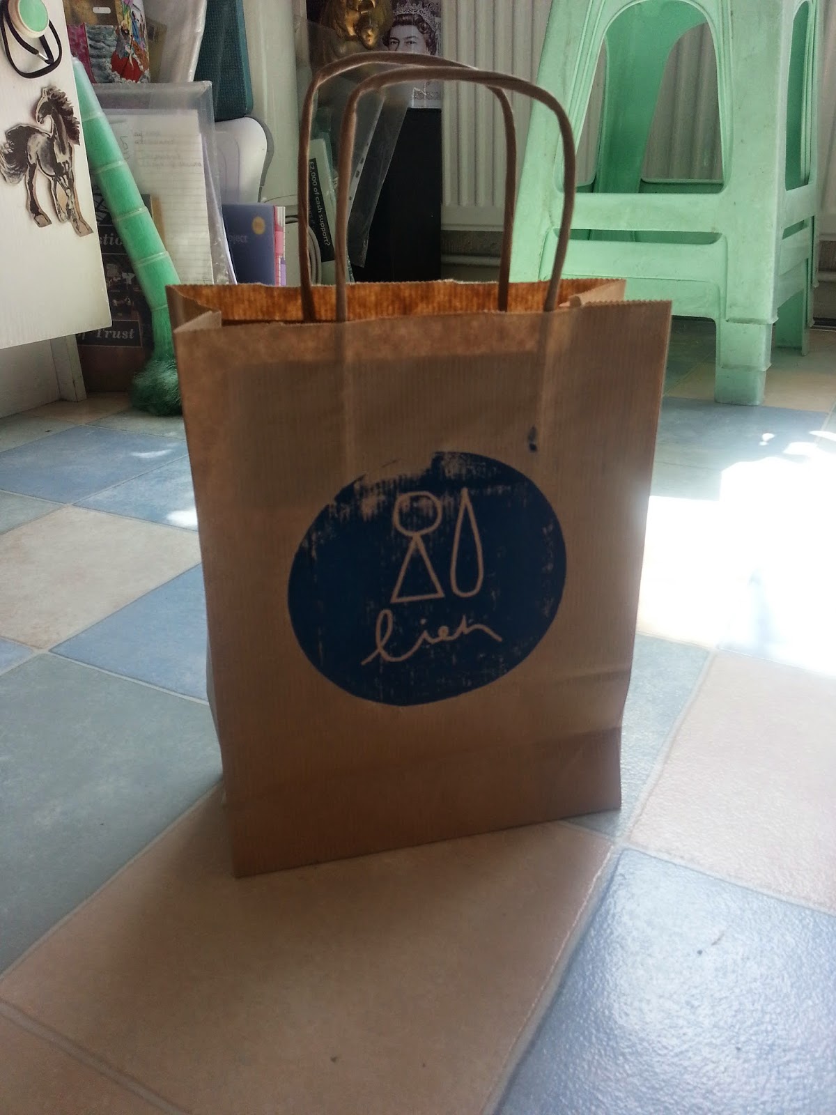
Day 2: After the completion of the brochure, I can now go on to my bag and apron design. For the bag design, I looked at paper bags and draw string bags. Paper bags is inexpensive but has that homemade quaility but the draw string bag is different and rarely seen. In the end I chose the paper bag because I think it will hold the products much better and also its more constructed with a precise form. So I done some sketches of where I should place my logo.


Here I also did the same process with the apron, I looked that different designs of aprons and how I can work my logo into certain places, like on the pocket or just placed above it. I wanted my specialist to wear an apron to show a professional appearance and still promote the brand too. In the end, I decided to go with align it to the centre because it follows up with the labels on the containers and I think changing the alignment will confuse people about the position of the logo. After I established the position, I am ready to lino print my logo onto both bag and apron.


FINAL OUTCOME (APRON AND BAG)
I feel that the outcome was successful although not all of the ink was printed, but in a way it does show a sense of homemade and being hands on with the process of making, instead of getting it made by machines. Therefore reflects the brand concept of customising the creams. I think the size of the lino print was an okay size for both the bag and apron which I like how it both shares the same logo instead of having a bigger size than another just to fit it into the empty space.


Day 3: Here I was able to assemble and display all of my outcomes in a neat manner, I really like the overall image because it doesn't drown the brand with the blue colour because of the mini colour palette from the containers and also from the paper bag and brochure. I like how there is different dimension and height that builds up and presents a variety of aspects of the brand. I positioned my containers in a curve to mimic the circular shape of the logo and creates an idea of a family. The tissue paper adds volume to the bag and matches well with the apron.
Also, I wish I could have been more organised for sketchbooks and blogs which could of led to more time to further develop and enhance. I felt that at times I was lost and needed some guidance from my tutors and peers and although it was helpful and useful to get advice from, I thought it wasted some time to adjust to coming up with a idea that I was going to use. Also I did felt lazy at times because of the stress of the project, which did affect my mindset and drive to work. I think that the stress was managable to force myself to work but it cause irriatation to continue while feeling stressed.
The
final outcome presented my project very well and I am satisifed to
see how my progression through my blog and also the creative
progression in my sketchbook. If I could make any
improvements I think that I should have took more consideration with the
placment of logos by doing some prototyping and also further develop
the bag and apron stages as there wasn't much designing of it on my
sketchbook.
SUMMARY
The
final outcomes from my project
are very different to what I first proposed in the initial pitch. During
my final major project process I was able to finalise my concept of
tailoring to people's skin types than to just brand natural ingredients
inspired skin care ranges. I think that my concept was a good idea
considering it is an unique selling point and therefore continue to work
my way to visually illustrate it. At the start, I didn't have a clear
idea of my different outcomes to show for the exhibition, but
nevertheless the outcomes that I will present is something I am proud of
making. I did have some differculties with technique issue but luckily I
quickly resolved them in the end.
Also, I wish I could have been more organised for sketchbooks and blogs which could of led to more time to further develop and enhance. I felt that at times I was lost and needed some guidance from my tutors and peers and although it was helpful and useful to get advice from, I thought it wasted some time to adjust to coming up with a idea that I was going to use. Also I did felt lazy at times because of the stress of the project, which did affect my mindset and drive to work. I think that the stress was managable to force myself to work but it cause irriatation to continue while feeling stressed.


