Today was very different to our usual routine of rotations where we generate ideas and produce physical outcomes at the end of the day, this mornings agenda was to learn the basics of three softwares; - Photoshop, Illustrator & InDesign. I am comfortable with photoshop from using it in my A Levels but rarely know any knowledge from the other two softwares, Anna was very helpful going over the basics of commands and some shortcut we could apply.
Here is the orginal image of myself (Close up)
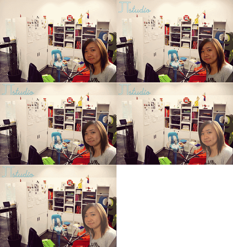
I chosen an image of a graphic studio which was colourful, modern and reflects creative minds because I don't like the idea of the stereotypical office with black, white and grey interior and instead work in a space while it's welcoming and invites ideas to generate. I used the pen tool to cut myself out of the original image and placed myself at the bottom right, since I'm familiar with photoshop I find this bit easy to manage. Then I played about with the filters and contrast to make me blend in more.
Outcome
After we completed our background on photoshop, we opened up illustrator and learnt some skills such as the achor points, using the white arrow and pen tool to manipulate the achor points to create curves etc. Our task was to create a logo and I used a mixture of type and hand drawn, the colour scheme is black, grey and blue and I experimented everything onto a page.
In the end I chose this logo, surprisingly it does resemble the Ravensbourne logo which I unintentional done, I just thought how my logo was readable and has some sort of a personal twist to it.
Final Outcome
This is my incomplete final outcome, I did many trial and errors while taking in mind of using the new information of using InDesign I just learnt from Anna and ways it will look unique and also break the typical column structure, at first my logo was grey but against the muted background it was difficult to read, also Anna mention to use bright colours to attract attention and lightens up the poster. Unfortunately I didn't save the illustrator file to go back and change the colour, instead I opened up a PNG file and changed it form there, I faced some difficulties since I wasn't comfortable with the software and so I didn't know how to remove the white space in 'e' and left it. The 200 words took a long time for me to structure because there were so many ways to place it, I done around the storage place by manipulating the anchor points.


I like your final outcome and think you have dealt with using new technology well. The main thing I think that could be improved is that you could make the image of you blend in better with the background as at the moment it feels cut out. you could do this using tools on Photoshop.
ReplyDeleteYour final outcome is simple and effective, what I like is how creative the logo is as it clearly displays ownership and branding which is key, the images used also compliments eachother well.
ReplyDeleteEventhough it is incomplete, to improve it you could experiment with diffrent typefaces and colour to make the image look more aesthically pleasing, the layout of text could be seperated into two colomns to show that you thought of the structure more, you should also blend the image into the background to make it look apart of the image.