{20/01/14- 31/01/14}
I was given to select three out six projects to complete in a span of two weeks, I have chosen 'Type Transformer', 'Alphabetype' and 'Illustration Covers'.
TYPE TRANSFORMER
I chose this project because I thought it would be a fun experience to be playful with type and recreate it into something different, I sketched out many ideas on an A3 and selected a collection I wanted to further develop. With the selected types I scanned it into photoshop and used the vector tool to thicken the lines and align them straight.
It was a straightforward project and I was able to complete it in a good amount of time, I enjoyed it and would create more outcomes if I had the chance.


Eye / Flower / Ear
ALPHABETYPE
The next project I chose was alphabetype because it is still along the lines of using type but instead here I am able to create my own type, I tried out different ideas from the suggestions from the project and I liked the idea of using plants/leaves/bamboos to create the structure of each letters. I used primary observation by taking pictures of bamboo plants in my house and using that to follow the shadows and structure.


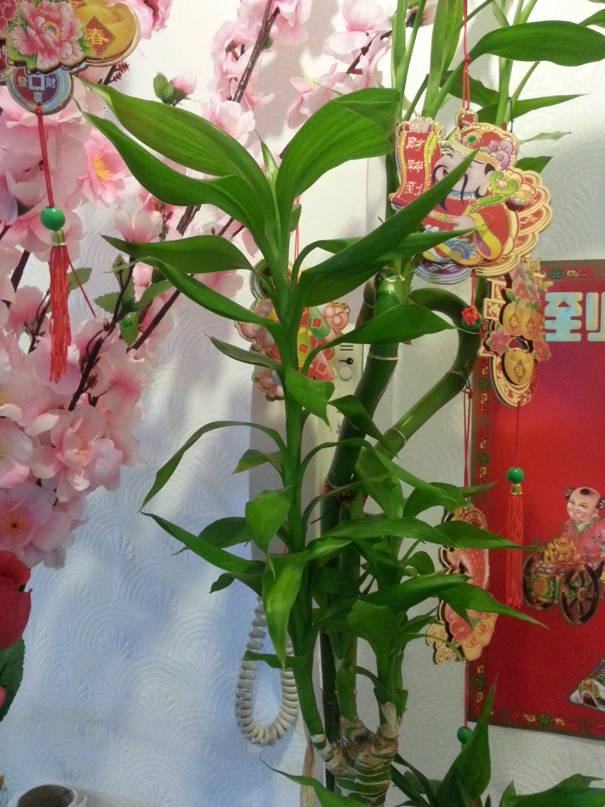


Here I used a black fineliner to crosshatch the tone and shape to each letter, it was time consuming but I really like this technique so it wasn't a major problem for me. Once it was complete I scanned all the letters including numbers and arranged them to align and resize when appropiate.


In the end I was very happy with the result, the folds of the leaves and the straight bamboo stick made it very easy to manipulate into the letters, the most time consuming was resizing nad aligning the letters onto photoshop but I think the fineliner gave it a delicate feel and I like how there is a contrast of thickness.
ILLUSTRATION COVER
Finally my third project that I chosen was the illustration cover, this project instructed to design a new cover for New Scientist or The Economist with the given topics, I thoroughly researched both magazines and what appealed to me was 'Media Control'. I chose this because I thought it was a easy project to interpert and I had many ideas for it.
My idea was focused on media control on children and how it affects them mentally, children is exposed to many things that its hard to avoid, such as advertisement and unappropiate movies. So I sketched out characters to portray the child-like mentality and have the characteristics of hypnotis(?) eyes to show the how they are receiving the media, which in this case it is a TV. I didn't want to visually draw a TV but instead have the character face toward to show the impression of our viewpoint to be the TV screen.

Here is the sketches of the characters, I wanted it to show different characteristics hence why each character is different in terms of clothing, colour and height. I wanted to get the idea of regardless of background etc. that it is possible any child can be controlled by media.

I really like the fade edges to transition the black for the rest of the cover, it looks seemless and has the impression of a TV screen and slowly controlling their minds.
I personally like the alphabetype simply because I was able to create my own type which I enjoy and I prefer type-based projects more than most projects I have done so far.
No comments:
Post a Comment